
New look, same market-leading pharmacist-led services
•
July 24, 2025
We're delighted to showcase the new brand look and feel for Medicines Management Solutions, with a refreshed aesthetic and an emphasis on our credentials as a leading provider of GP pharmacist services.
If you’re familiar with Medicines Management Solutions and our work over the past 18 years in providing primary care pharmacist solutions, you’ll have seen our services evolve with the needs of our sector.
With that in mind, we’re excited to announce the evolution of the MMS brand to reflect a more modern look and feel to our business.
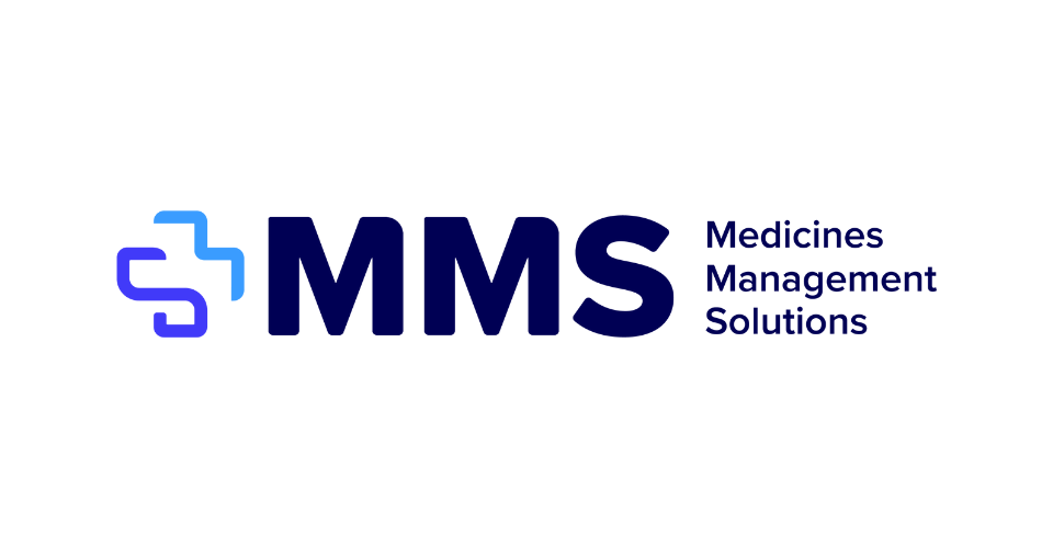
Our new logo combines the M and S of the company name to tie seamlessly into our MMS cross, aligned to the internationally recognised symbol of health, care, and support. This monogram represents our approach to working with GP practices, PCNs, ICBs and pharmaceutical companies, as we support them in providing great outcomes for their patients, and providing market-leading services that provide key benefits to healthcare professionals and organisations.
The two-tone colour palette and curved edges help to create movement and a bold, digital tone, emphasising how we work in an agile, digital-first manner for our clients.
Keep your eyes peeled as we roll out our new brand identity in the coming weeks and months.